SwipeDecor
This class defines the various configurations and settings related to item view used in SwipePlaceHolderView.
Usage
Provide the new instance of SwipeDecor with custom settings to the SwipeViewBuilder instance available in the SwipePlaceHolderView.
swipePlaceHolderView.getBuilder()
        .setSwipeDecor(new SwipeDecor()
            .setPaddingTop(20)
            .setSwipeMaxChangeAngle(2f);
            // other settings
Settings and Configurations
Top/Bottom Padding
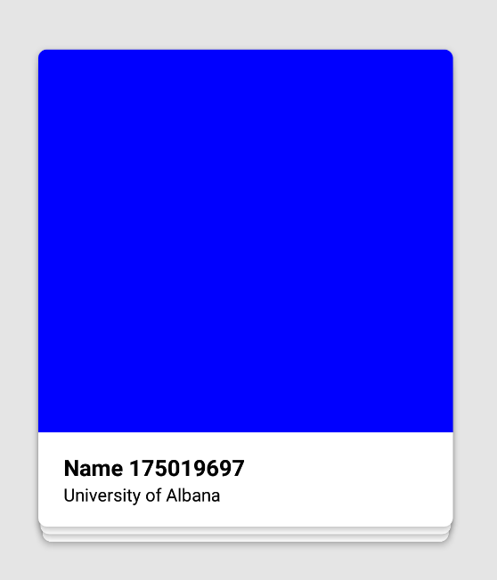
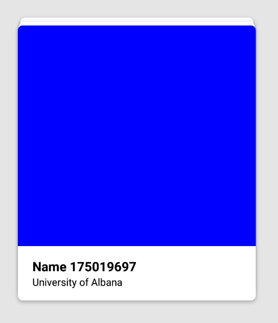
new SwipeDecor().setPaddingTop(20);// in dp
new SwipeDecor().setPaddingTop(-20);// in dp
Positive value set item views arranged top to bottom and negative value set item views arranges bottom to top.
Left/Right Padding
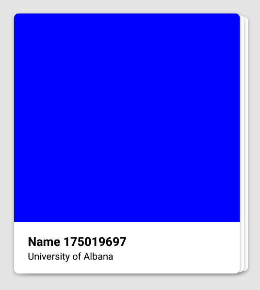
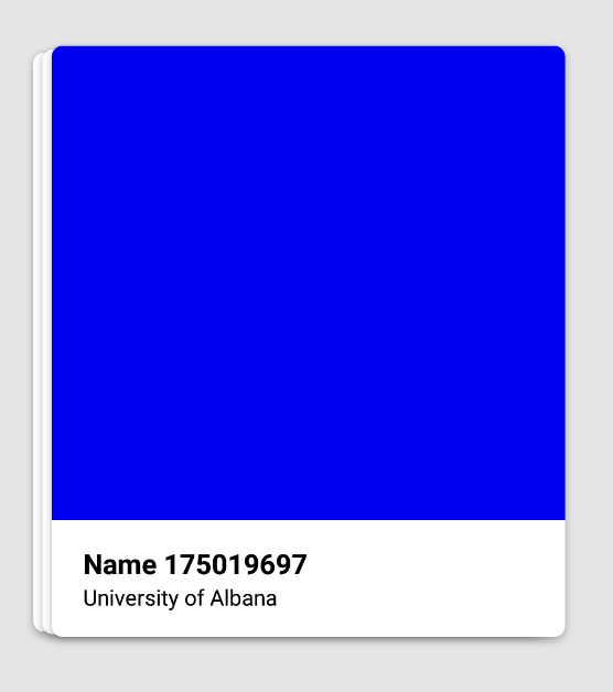
new SwipeDecor().setPaddingLeft(20);
new SwipeDecor().setPaddingLeft(-20);
Positive value set item views arranged left to right and negative value set item views arranges right to left.
Margin
new SwipeDecor().setMarginTop(200); // Top margin
new SwipeDecor().setMarginLeft(200); // Left margin
Set the margin of the item views with respect to the SwipePlaceHolderView display area.
Relative Scale
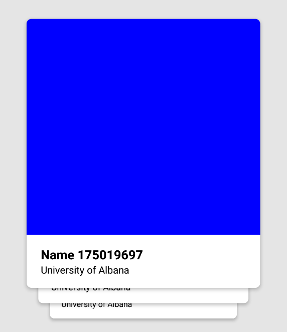
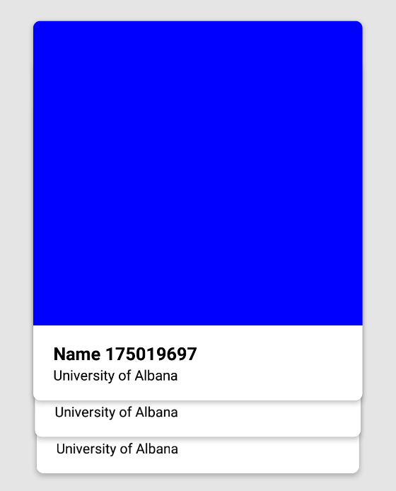
new SwipeDecor()
    .setPaddingTop(100)
    .setRelativeScale(0.1f); // higher scaling
// Versus
new SwipeDecor()
    .setPaddingTop(100)
    .setRelativeScale(0.01f); // lower scaling
Relative scaling defines the size of item views placed below with respect to item view place above.
Swipe in/out state display view
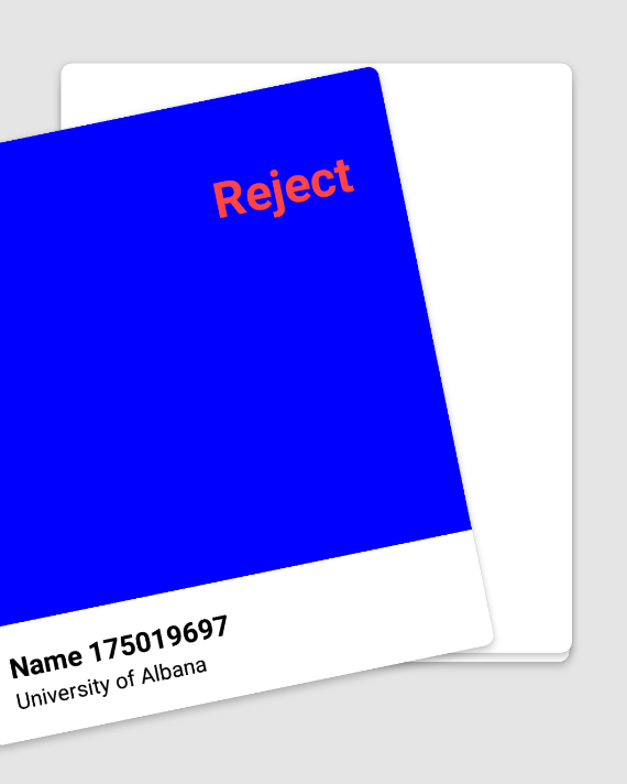
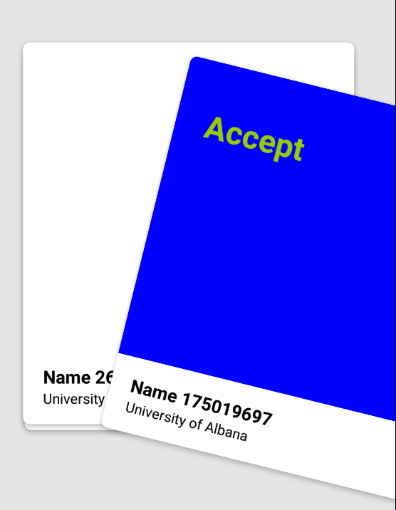
We can provide layouts that shows up when an item view is in the state of either swipe in or swipe out.
new SwipeDecor()
    .setSwipeInMsgLayoutId(R.layout.tinder_swipe_in_msg_view)
    .setSwipeOutMsgLayoutId(R.layout.tinder_swipe_out_msg_view);
Example: Swipe in layout R.layout.tinder_swipe_in_msg_view
<?xml version="1.0" encoding="utf-8"?>
<LinearLayout
    xmlns:android="http://schemas.android.com/apk/res/android"
    android:orientation="vertical"
    android:layout_width="350dp"
    android:layout_height="425dp">
    <TextView
        android:layout_width="wrap_content"
        android:layout_height="wrap_content"
        android:textSize="32sp"
        android:textStyle="bold"
        android:layout_margin="40dp"
        android:textColor="@android:color/holo_green_light"
        android:text="Accept"/>
</LinearLayout>
Animate Scale
We can disable the lower card scale and rise animation with respect to the top card when the top card is moving.
new SwipeDecor().setAnimateScale(false);
Set the gravity of the swipe in/out message layout.
new SwipeDecor()
    .setSwipeInMsgGravity(Gravity.LEFT)
    .setSwipeOutMsgGravity(Gravity.RIGHT);
Set distance to move for swipe in/out massage layout to show.
We can configure the distance an item view should move w.r.t its original position for the swipe in/out layout to be shown.
new SwipeDecor().setSwipeDistToDisplayMsg(100);
Set swipe animation factor
This defines the acceleration of the item view when it is animated while swiped in/out.
new SwipeDecor().setSwipeAnimFactor(0.75f);
Set swipe animation time
This defines the time taken for the item view when it is animated while swiped in/out.
new SwipeDecor().setSwipeAnimTime(500);
Set rotation angle when the item view is moving.
new SwipeDecor().setSwipeRotationAngle(10);
Set the item view width and height programmatically.
This will set the width and height of the item view according to the available space on the screen.
If there is some view below the SwipePlaceHolderView and we want the item view to be able to slide on top of the bottom view while allowing the bottom view to be clickable, we can do the following:
int bottomMargin = Utils.dpToPx(160); // if there is some view of size 160 dp
Point windowSize = Utils.getDisplaySize(getWindowManager());
swipeView.getBuilder().setSwipeDecor(
    new SwipeDecor()
            .setViewWidth(windowSize.x)
            .setViewHeight(windowSize.y - bottomMargin)
            .setViewGravity(Gravity.TOP); // set the gravity of the item view w.r.t SwipePlaceHolderView
Set maximum change in angle between two successive item view moves.
This property can help control the jerks that may appear while changing angles while the item view is moving.
new SwipeDecor().setSwipeMaxChangeAngle(1f);
